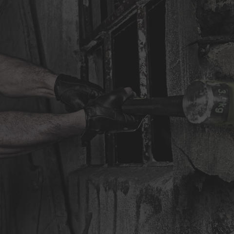


We were up to the challenge of building a new site that clearly demonstrated their knowledge and innovation.
For a long time, industrial machinery had been built in a linear process with the mindset of doing things the way they’ve always been done. Then along came Kaber, an industrial design and innovation consultancy that believes that any product can be improved. Kaber built its reputation on their incredible design and engineering, as well as a deep understanding of the manufacturing process, in order to achieve contracts with Fortune 500 companies as well as fast-paced startups.
Naturally, we were excited when Charles Weber, Founder/CEO of Kaber, connected with us to bring his website to the next level. We had worked with him in our infancy as a digital agency, when we helped establish their branding and original website, and were ecstatic to collaborate again.
Most consumer grade products are built with an attention to detail in order to move them off the shelves, but in the commercial machinery and tool industry, the focus has been primarily on function rather than form. Kaber’s use of design as a catalyst to revolutionize manufacturing put them in a unique situation: a market that is somewhat untapped.
Other industrial product designers and manufacturers seem to view the end-user in this market as disinterested in design, as if simply because tools and machinery will become used and often dirty on a job site that means they don’t actually need to be beautifully built. Wrong. These consumers take pride in their work and in their tools. We decided that our approach with the new site would be to showcase the painstaking attention-to-detail and pride that goes into Kaber’s design and engineering.
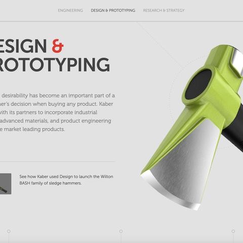
Together with Kaber, we established two main goals for the website redesign, increase conversions and demonstrate high-end design and engineering.
In an effort to build a better-informed strategy, we did a site audit of several consumer product manufacturers who emphasize strong design. We knew we needed to look at consumer products since the commercial industry was lacking in design-centric offerings. This research step gave us insight into what seemed to work, as well as what didn’t, in featuring technical aspects of top-tier products. We used a very clean design and subtle movement to highlight the aesthetic appeal of each featured product.
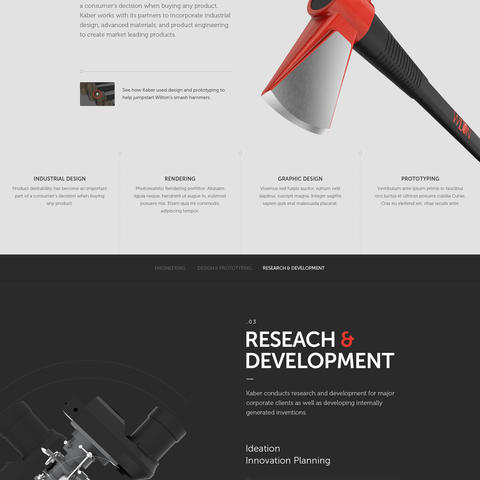
Through a series of surveys with Kaber, as well as our experience from their first website, we knew that the approach for content had to be compelling, informative and make a connection with the potential customer. We developed a series of calls-to-action designed to lead each visitor through three stunning product case studies and then ultimately to connect directly with Charles Weber himself. We were excited to incorporate the bold colors and clean lines from the branding we did for Kaber into the overall design.
Finally, we knew we wanted a way to show a product in action and make that instant connection to the job site. Video and photography demonstrated the quality, durability and outstanding design of the showcased products.
Working with Kaber is an eye-opening experience. It’s energizing to observe a brand using great design to change their industry, especially when comparing it to ours where trends in design are fluid and constantly evolving. This project gave us pause to think about how we approach our own work and the power that well-planned design can leverage.
Before building their website, we spent a lot of time researching best practices and thinking about where we wanted to go with the site. Prep work was critical because we knew that a design-centric company needed a high level of sophistication in the design of their website, beyond the frills of the latest trends. In the end, we utilized some trendy elements but our biggest focus was on finely-tuned color and motion to put the emphasis on the outstanding execution of Kaber’s work.
