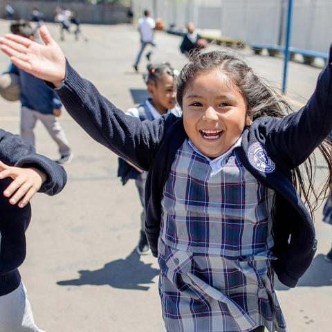


#GivingTuesday is a day that means so much to so many people, communities and organizations.
If you have not yet heard of #GivingTuesday, the quick explanation is this: a global day of giving that takes place the Tuesday after Thanksgiving. It is a hashtag - one that is very social media focused and provides individuals and communities a way to share fundraisers, good deeds, awareness and so on. The mission behind #GivingTuesday is to increase giving to nonprofits in all forms, as well as to help organizations build their capacity to fundraise, advance their mission, and connect with their community.
It needed a strong home base to capture information, share opportunities and engage with people who are eager to get involved. We were thrilled to be chosen to create their website and help with this movement.
We started with developing a deep understanding of what each audience needed in order to have a good experience with the website.
#GivingTuesday had a familiar problem: a lot of good information to share and multiple audiences who are visiting their website for different reasons. Organization and clear pathways were critical to creating a successful and user-friendly site.
We started with developing a deep understanding of what each audience needed in order to have a good experience with the website. As information was laid out, we built the pathways and calls-to-action so each user journey was quick to access and easy to understand. Our litmus test was repeated with each step of design, asking ourselves if this element (content, CTA, path, effect, etc.) feels inviting, engaging and encourage the user to participate?
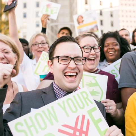
Together our teams agreed that in order for the #GivingTuesday movement to grow, people needed to see and feel the impact of the movement. Using real imagery supplied by participating individuals and organizations throughout the globe was key, as was presenting the facts and statistics in an engaging format. The hashtag, #GivingTuesday, is the heart of the conversation - where most people were engaging in sharing their own involvement on social media - and was incorporated throughout the site often.
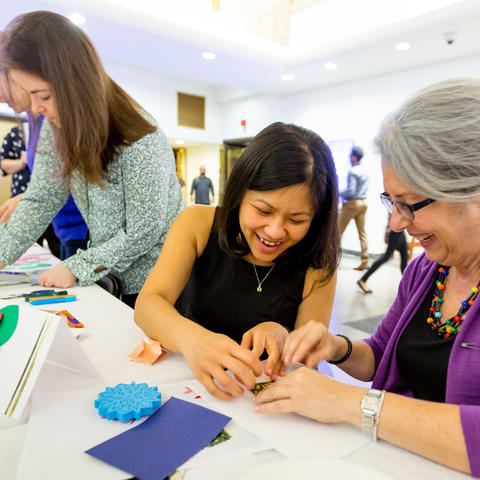
The leaders behind #GivingTuesday wanted organizations, small and large, to give meaningful thought to their campaigns, providing tools and examples to get them to plan ahead to use the day and promote it.
Empower organizations to own the movement, get creative and build momentum.
A significant portion of our research and discovery involved learning about the organizations involved in #GivingTuesday. This is their primary audience because organizations have the ability to talk to their audience/community and directly impact with a great campaign as adopted by them. The leaders behind #GivingTuesday wanted organizations, small and large, to give meaningful thought to their campaigns, providing tools and examples to get them to plan ahead to use the day and promote it. The dedicated Organizations page has a full metric ton of information, yet isn’t overwhelming. We broke it down and created a layout that helps guide leaders through the various steps, from simply getting started to finalizing their press releases. Animations add another touch of engagement, while a secondary navigation quickly gets the familiar user to the right place.
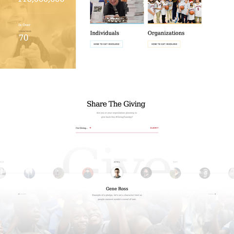
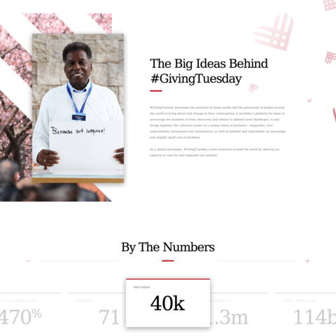
We’re both humbled by and proud of the #GivingTuesday movement. Their growth since we were first introduced is simply incredible. The impact, astounding. We love working with their team to continuously make little tweaks and updates, as well as standby on alert while the site’s traffic swells to a tsunami of visitors as the big day approaches. It’s an exciting time we look forward to each year.
