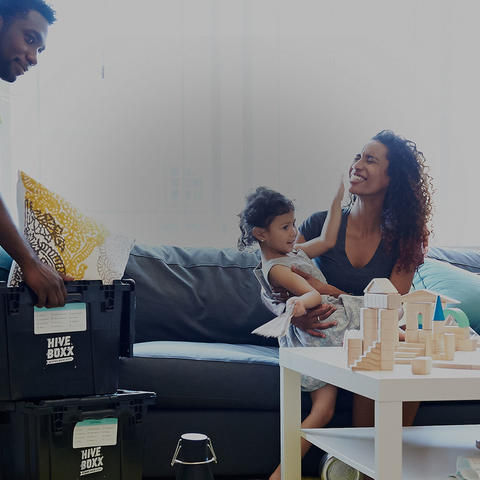


We were thrilled to meet Wesley, the founder of HiveBoxx. He’s young, smart, driven and saw an opportunity to solve a problem by creating a business in the Seattle area. Wesley is working to transform the ubiquitous “moving sucks” into a better experience. He’s thinking in terms of convenience, saving money and reducing the environmental impact by making a simple but brilliant change in the way we pack, stack and move.
But before you start packing up house, you need to have a buttery smooth experience with the HiveBoxx brand and website in order to trust their team to come through on making your move easy. That’s where we came in. From a custom e-commerce to an intuitive rental process, we helped deliver a brand that feels authentic and fresh.
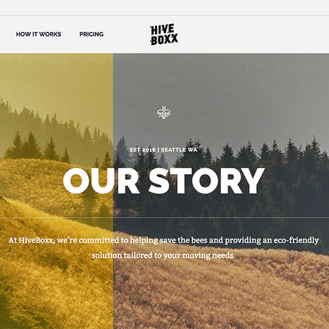
At HiveBoxx, we're committed to help save the bees and provide an eco-friendly solution tailored to your moving needs.
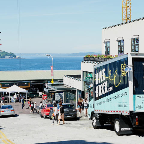
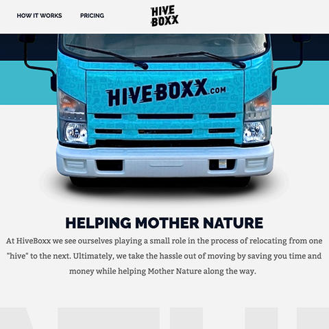
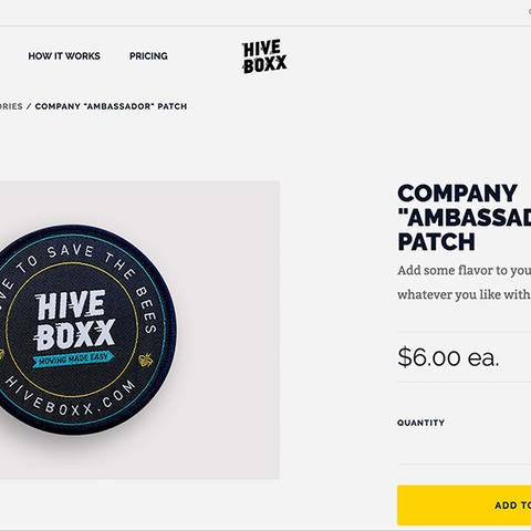
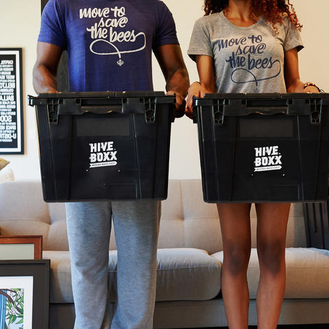
The HiveBoxx design vibe is clean, playful and urban. They had a few branding elements in place, like a cool logo and a start to some graphic design. We refined the overall elements, then created a truck wrap, signage, t-shirts, patch, stickers, guides, booklets and more to ensure that each customer and employee touch point felt fresh and fun. It took a few iterations to get everything just right. But hey, the t-shirts are so hip that you’ll want to order one even if you’ve never set foot in the 98101.
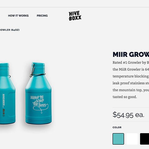
Part of the HiveBoxx mission is to contribute to efforts to save the bee population. Proceeds are donated with every purchase, so the bee became an integral part of the design. Patterns, icons and the color palette were designed and selected to reinforce this aspect of the business.
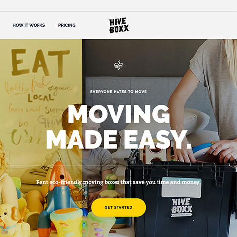
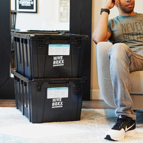
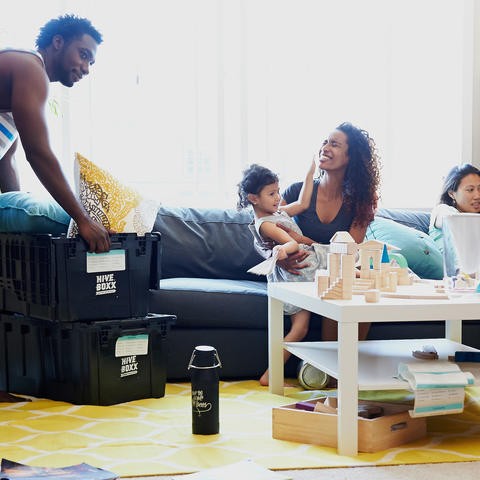
The colors, icons, typography and vibe were applied throughout the design of the website. We used imagery that depicts the real life emotion of unpacking your sentimental treasures and exploring your new home without hassle. Keeping consistent with the light, playful vibe created a feeling that transferred to their services. You can tell your move is going to be less hassle and more enjoyable.

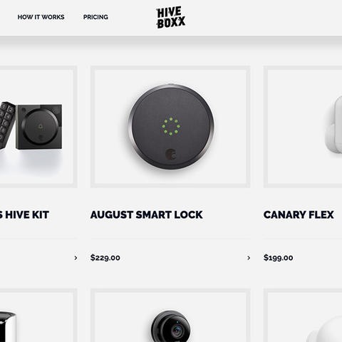
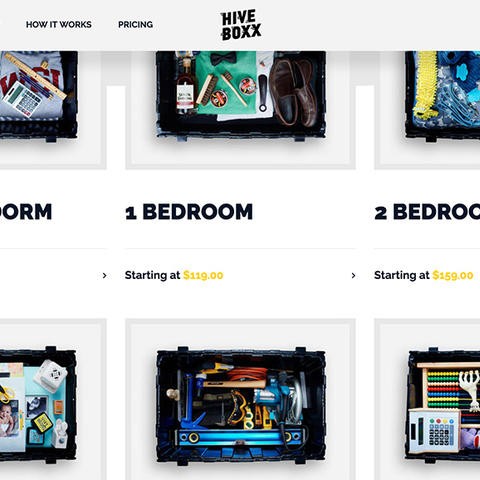
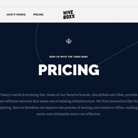
Mobile optimization was key to producing a seamless experience for the 25-35 year old customers who are using their smartphones regularly for shopping and services. We incorporated many engaging animations from the desktop experience while simplifying the experience for better load times. The core strategy was clear: mobile use had to be quick, easy and enjoyable while keeping with the playful and clean vibe.
In addition, managing the site had to be flexible as well. With permission levels for full admin to new recruits, users were set up to help manage accounts, update inventory, add new products and manage the site as needed. The delivery drivers have their own mobile interface for confirming delivery, collecting payment and adding on extras at the door when upsell opportunities appear.


There are a lot of fine details behind the scenes of any website that tracks inventory, scheduling, on-demand upgrades, and more. Taking the time to step back and think through the details of many possible business interactions helps to create a seamless experience for customers and managers.
